SIMPLE+Westpac · 2023 – 2024 · 5 min read
Replacing a spreadsheet the business depended on
Two new serviceability tools and two improved ones for bankers and brokers. 90+ SUS in testing.
Role card
- Project
- SIMPLE+
- Role
- Lead designer
- Stage
- Senior
- Organisation
- Westpac
- Sector
- Banking
- Duration
- 2023 – 2024
- Themes
- Designing the whole service, not the interface; Scaling design beyond myself
In sixty seconds
Situation
Bankers and brokers depended on an Excel-based MVP for serviceability calculations. Replacing it meant preserving its operational knowledge in tools for different users and decisions.
Reframe
The spreadsheet exposed shared calculations, exceptions and handoffs. We treated it as operational truth and defined four tool boundaries around work, not worksheets.
Outcome
We delivered two new serviceability tools and improved two existing ones for bankers and brokers. Testing returned a measured SUS score above 90, while shared patterns reduced variation across all four journeys.
Ask Orko about this studySite guide
Short, scripted answers drawn from this page. Pick a question to open them.
Team and scope
Team
Me as lead designer, with product, analysis, engineering, content, design, credit specialists, business bankers and brokers.
Scope
I owned synthesis, tool boundaries, interaction design and testing, sharing calculation and delivery decisions. I did not own lending policy, calculation approval, architecture or release funding.
Confidentiality
The boundary map, calculation detail and quote were recreated or generalised; no customer data, production screens or internal system names are shown.
01
The situation and the stakes
Serviceability calculations help bankers and brokers decide whether a business lending proposal can proceed. The Excel-based MVP held calculations, prompts and exceptions used daily, but demanded specialist knowledge.
Replacing it risked either reproducing spreadsheet density or removing logic that kept decisions accurate. Bankers and brokers also began with different information and needed different explanation; one universal tool would make each navigate detail intended for the other.
02
Why it was hard
The grid mixed calculation logic, data entry, policy prompts, workarounds and expert interpretation. Its density exposed unresolved boundaries; hiding complexity would not remove it. Design could clarify lending policy and calculation rules, but not redefine them, so accountable specialists reviewed every simplification.
Bankers and brokers shared a calculation core but differed in data, frequency and follow-up. We had to create two journeys and improve two without forming four unrelated experiences or forcing them onto one release path.
03
The reframe
The spreadsheet was treated as disposable legacy, encouraging screens based on worksheet sections. Research showed experienced users had made it an operational model: grid regions represented decisions, repeated formulas exposed a shared core, and workarounds marked policy or handoffs needing explanation.
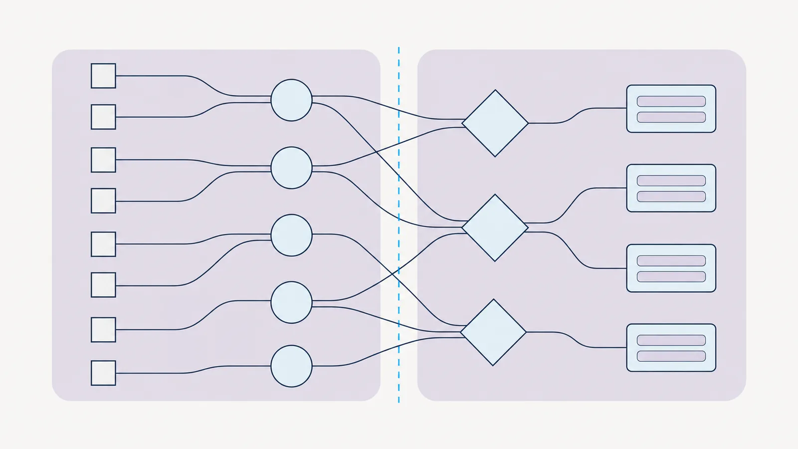
I overlaid work, users and decisions instead of copying tabs. Four regions emerged with distinct entry conditions and outcomes, changing the question from ‘How do we digitise this sheet?’ to ‘Where should one tool stop and another begin?’
We defined four boundaries: two new tools and two existing tools to improve. Shared calculation patterns sat at the centre while each journey showed relevant context. The spreadsheet became traceable source evidence, not the interface.

04
What I did, and what I chose not to do
I observed bankers and brokers using the MVP and paired their behaviour with credit specialists’ walkthrough. Mapping inputs, calculations, decisions and outputs made boundaries reviewable before interface work and showed product and technology where separation created dependencies.
I designed guided sequences around each next decision, with specialist detail available progressively and results users could check. Shared patterns covered financial inputs, repeated entities, validation, summaries and result states; we tested each across tools before calling it reusable. Realistic but synthetic scenarios refined sequence and language.
I did not copy every option or create one universal journey. Rare cases needing policy interpretation retained specialist handling; a universal path would add irrelevant steps and hide role differences. Shared calculations and patterns provided consistency without pretending bankers and brokers worked identically.
05
How I brought people with me
The spreadsheet gave every discipline a shared starting point. Bankers and brokers annotated use, credit specialists marked policy intent, and analysts and engineers traced calculations. Scenario-based boundary sessions established who started work, what completed it and what crossed tools, producing agreement on four journeys and a shared core.
Prototypes made policy and interaction consequences visible together. Reviewers added fields only when they changed a calculation or handoff. Cross-tool reviews recorded required reuse and justified variation. A SUS result above 90 gave a common quality signal, but covered tested journeys, not every exception or production condition.
“We did not need one cleaner spreadsheet. We needed clear boundaries around the decisions it had been holding together.”
06
What changed
SIMPLE+ produced two new serviceability tools and improved two existing ones around a shared calculation core. Measured usability testing returned a SUS score above 90; it covered testing, not long-term production adoption. Observed behaviour suggested less reliance on remembering grid logic, with no confirmed production measure of time saved.
Shared financial-data, validation and result patterns were reused across four designed journeys; broader adoption outside SIMPLE+ was not measured and is not claimed. Treating the spreadsheet as work and policy evidence helped product, design, credit and technology agree boundaries before screens.
- EmployeeObserved
- Two new serviceability tools and two improved tools gave bankers and brokers role-specific journeys around a shared calculation core.
- BusinessMeasured
- Usability testing returned a SUS score above 90 across the tested serviceability journeys.
- OrganisationObserved
- Shared financial-input, validation and result patterns were reused across all four designed tools.
07
What I carry forward
An operational spreadsheet is accumulated knowledge, not legacy to discard. Reading decisions, exceptions and handoffs produced boundaries matching banker and broker work. I now map the artefact people use, record each boundary against its policy source, and plan production follow-up so design keeps learning after release.