Business Lending websiteWestpac · 2021 – 2022 · 3 min read
Helping customers find the right product before they apply
Organic search visits up 37.5%, 66 more keywords ranking top three, click-through up 50%.
Role card
- Project
- Business Lending website
- Role
- CX/UX Designer
- Stage
- Senior
- Organisation
- Westpac
- Sector
- Banking
- Duration
- 2021 – 2022
- Themes
- Shaping decisions, not just solutions
In sixty seconds
Situation
Business lending pages followed product definitions, while customers searched for what they needed. The mismatch made suitable options harder to find before application.
Reframe
Search logs and tree testing showed that customers did not follow the bank's product boundaries. We regrouped content around customer needs and kept product detail for decisions.
Outcome
After the information architecture redesign, organic search visits increased 37.5%, 66 additional keywords ranked in the top three and click-through increased 50%.
Ask Orko about this studySite guide
Short, scripted answers drawn from this page. Pick a question to open them.
Team and scope
Team
Me as experience designer, with a product owner, content, analytics and search specialists, and business lending subject-matter experts.
Scope
I owned research, synthesis, tree testing, taxonomy and navigation; shared naming decisions with content and product. I did not own search algorithms, product policy, campaigns or analytics implementation.
Confidentiality
The taxonomy and research detail were recreated or generalised; no customer data or internal search terms are shown.
01
The situation and the stakes
Customers reached business lending through search before knowing the bank's product names. The site then presented categories shaped by the product portfolio. Choosing the wrong branch risked comparing an unsuitable option or leaving before making an enquiry.
Findability determined whether useful product information appeared for customers’ language. The task was to recognise their intent while preserving accurate product definitions, not promote one product harder. Those definitions still mattered once customers began comparing options and preparing to apply.
02
The reframe
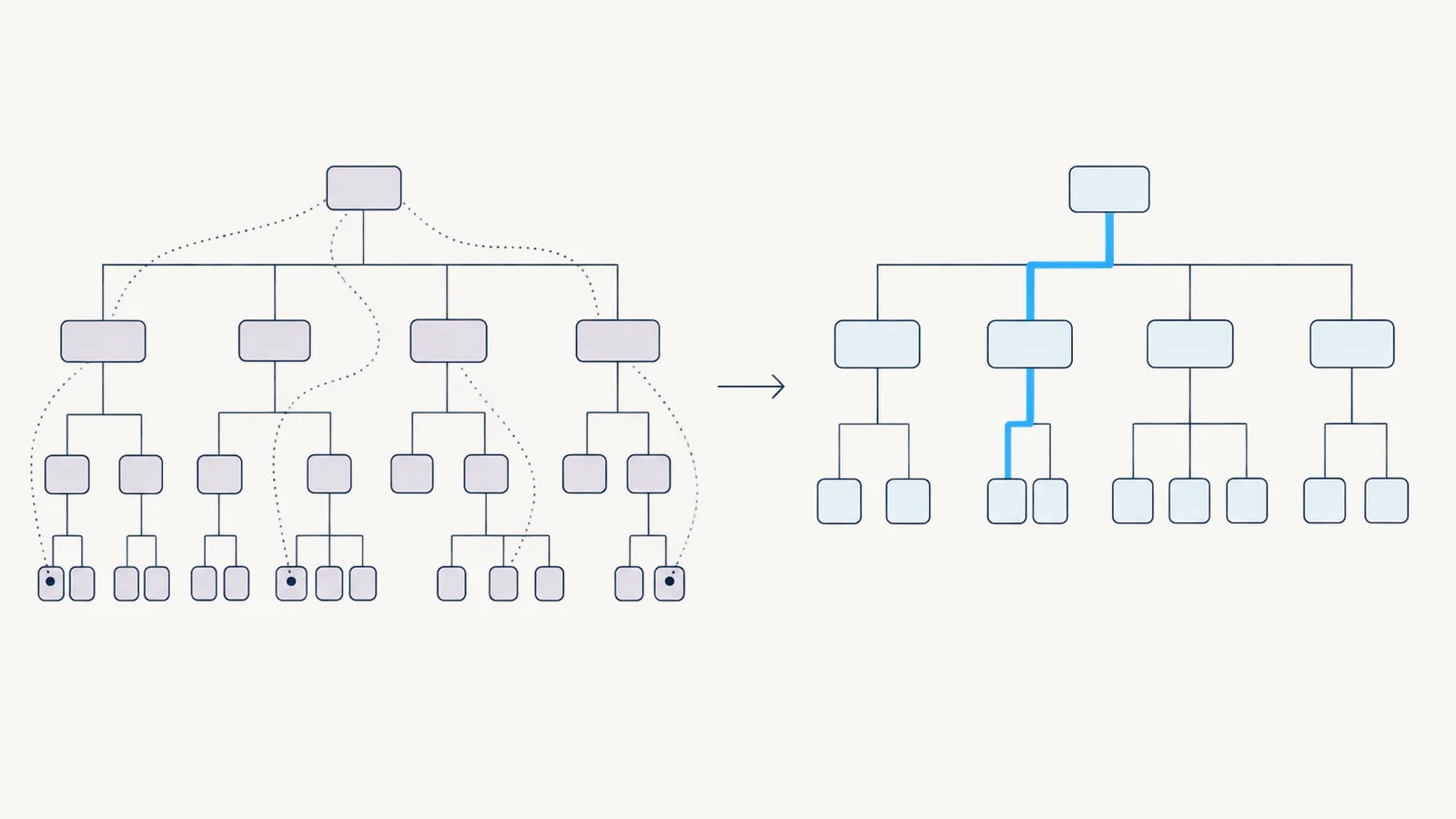
Clearer product descriptions could not fix the existing hierarchy. Search logs showed customers using need-based language, while tree tests exposed hesitation and wrong turns around product-led labels. The structure, not only the copy, was making customers translate.
I recommended grouping primary routes around customer need, with product choices beneath them. We renamed branches using language supported by search evidence and tested whether people could predict where each path led. Product definitions remained, but no longer carried the whole navigation task.
03
What I did, and what I chose not to do
I compared recurring needs in search terms with the existing taxonomy. Content and product specialists helped turn those patterns into alternative groupings. Tree tests then checked whether participants could find suitable information from labels and hierarchy, without relying on page design or visual cues.
We revised labels and relationships where tests exposed ambiguous branches, then matched landing-page content to the same language. I did not redesign application journeys because evidence identified discovery and navigation as the immediate break. Deeper product consolidation required policy decisions beyond this scope, so we deferred it.
04
What changed
After product definitions, navigation and taxonomy were redesigned, organic search visits increased 37.5%, 66 additional keywords ranked in the top three and click-through increased 50%. These measures show improved discovery, though they do not prove every visitor chose the right product.
The team gained a taxonomy grounded in search behaviour and tree-test evidence rather than the organisation chart. Customer need became the entry point, with product information supporting comparison later in the path. That decision connected external search language directly to on-site navigation and gave later content decisions the same evidence base.
- CustomerMeasured
- Organic search visits increased 37.5%, with click-through increasing 50% after the information architecture redesign.
- BusinessMeasured
- Sixty-six additional keywords ranked in the top three after product definitions, navigation and taxonomy were redesigned.
05
What I carry forward
Structure is a testable claim about how customers think. Search language and tree tests showed where the bank required translation, and results followed the structural change rather than copy alone. I now start with customers’ words and a matched task test, making the first conversation about observed behaviour and evidence, not label preferences.