12 May 2026 · 5 min read
The blueprint is the argument
A service blueprint makes operational truth visible across roles. Used well, it lets an executive room discover the real problem together.
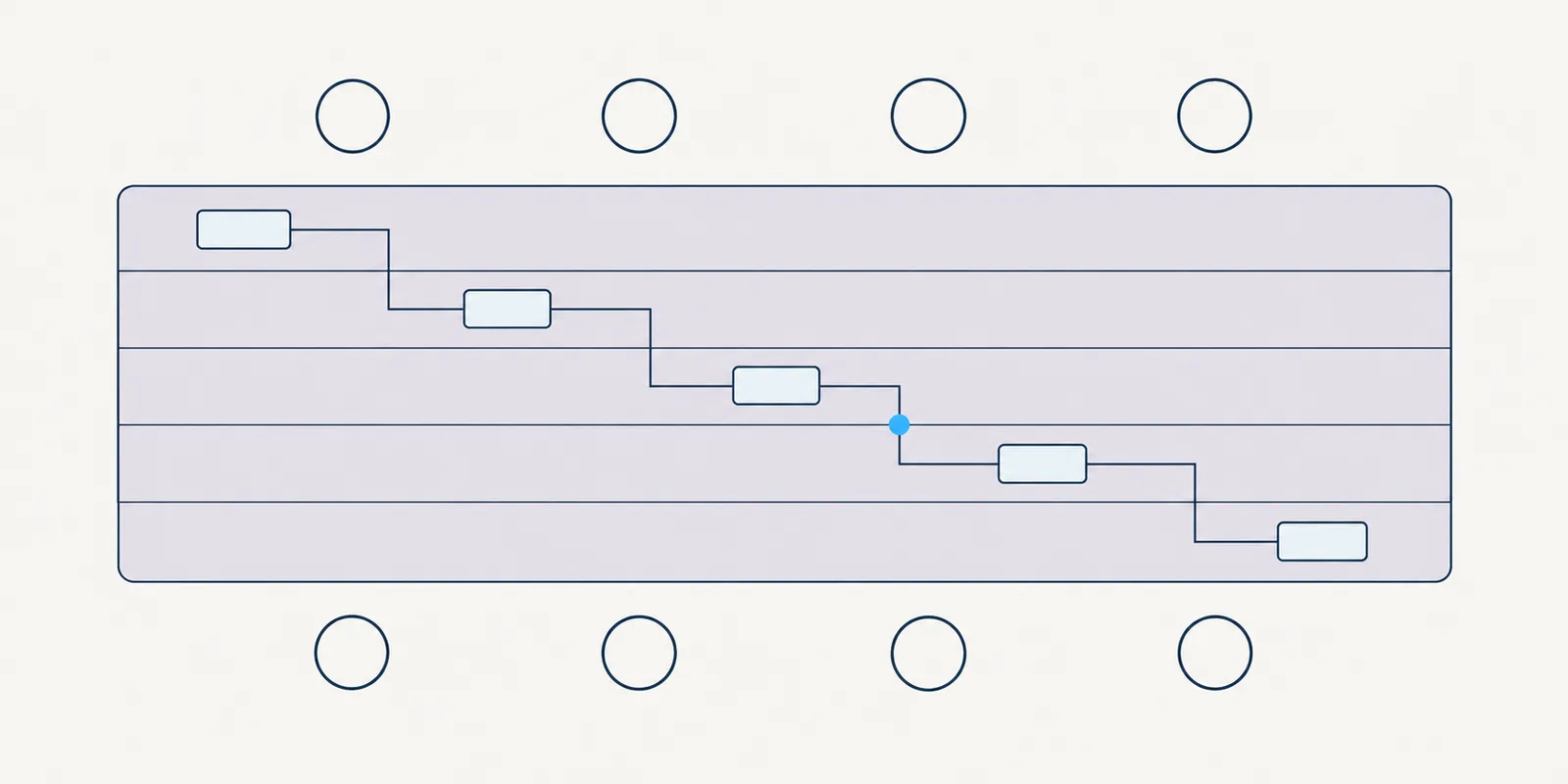
In a large organisation, no one sees the whole service. Customers see moments, employees see queues, operations see exceptions, and executives see measures assembled after the fact. Each view is accurate, but none is complete.
A service blueprint joins those views without pretending they are simple. It shows where an experience depends on policy, data, handoffs and ageing technology. That makes it more than documentation: the blueprint is the argument.
Why the deck loses
A deck moves in one direction, at the presenter's pace. It usually reduces a system to a sequence of claims: here is the problem, here is the evidence, here is the recommendation. By the final slide, the audience is debating the recommendation without sharing the same picture of the problem.
This is especially weak in executive rooms. Every leader interprets the slides through a different remit, then defends the part they control. A customer complaint becomes a channel issue, an employee workaround becomes training, and a delayed decision becomes a technology backlog item.
A blueprint changes the geometry of the conversation. People look at the same large surface, move between lanes and point to dependencies. Instead of asking them to accept my conclusion, I give them enough connected evidence to reach it themselves.
“The persuasive power of a blueprint comes from connection, not completeness.”
Put the whole service in the room
I normally begin with five lanes: customer, employee, operations, policy and data, and technology. The customer lane records goals, actions, uncertainty and waiting, not a polished journey. It should make clear what the person is trying to achieve and where the organisation asks them to carry its complexity.
The employee lane shows the work required to keep that promise. I include judgement, rework, searches, follow-up and the unofficial tools people create when formal ones fall short. These workarounds are often the clearest evidence of a broken service boundary.
Operations shows queues, handoffs, controls, ownership and exception paths. Policy and data shows the rules behind a decision, the information required, its source and its quality. Keeping policy and data visible prevents a team from treating a lawful constraint and a missing field as the same problem.
Technology shows systems, integrations, repeated entry and where status disappears between platforms. I avoid turning this lane into an architecture diagram. Its purpose is to explain service behaviour, including what an employee or customer experiences when a dependency fails.
Across the lanes, I mark evidence and uncertainty differently. Research, operational measures and observed workarounds should not look like assumptions. That distinction gives leaders permission to act on what is known and commission work where the picture remains weak.
Let the room find the break
The playback matters as much as the artefact. I send a short pre-read that explains the scope, evidence and decisions needed. In the room, I start with the customer's goal, then follow one ordinary case across every lane before discussing solutions.
I ask each leader to identify where the service promise first becomes hard to keep. Then we trace that point up and down the blueprint. A visible delay may begin in an unclear rule, a missing data field or an ownership gap several steps earlier.
My role is to keep the group on the service, not steer them towards a prepared answer. I test statements against the evidence, record disagreements and separate symptoms from causes. When the room names the break together, ownership of the response is broader than design.
I close with decisions, not applause for the map. We agree which problem will be addressed, what needs further evidence, who owns each action and what measure could show movement. The blueprint stays as a shared reference while those decisions are tested.
A lending example
On a lending program, the stated problem was that customers waited too long for an answer. The first request was for a clearer status screen. Mapping the service showed that the screen could only display a vague status because employees were waiting across several internal handoffs.
The blueprint connected repeated customer questions with employee rework, policy checks and data gathered at different times. The useful conversation moved from interface wording to when information should be collected and who could resolve an exception. A screen still mattered, but it was no longer mistaken for the whole answer.
Three ways it fails
The first failure is excessive detail. A blueprint can become a warehouse for every step, system and edge case until no one can see the argument. I keep a decision-level view and link detailed flows only where they explain a disputed dependency.
The second is drawing it too early. A neat future state built before fieldwork often records the organisation's assumptions with more confidence. I start rough, label gaps and let interviews, observation and operational evidence change the structure.
The third is treating the blueprint as the deliverable. Its value is not the file, workshop or wall space. Its value is the decision it makes possible, and whether teams keep using it to test changes across the whole service.
A good blueprint does not settle every question. It makes the consequential questions hard to avoid. In organisations divided by function, that shared view is often the most persuasive thing a designer can provide.